In this article I will be talking about how I work with colour in my photo retouching workflow. I will explain how I work and think about colour during editing. I will provide you with additional reading material and give you helpful tips on how to improve your understating of colour.
Colour is such a vast subject, that I won’t be able to include all of it in just one article. Hence, I name this one “introduction”, since this is just a small part of what can be done.
So, let’s begin.
Analyse
I usually start thinking about colour right at the beginning of my edit, during analysing stage, where I analyse each image in a photo series and decide what mood and emotions I want to convey. When I say I analyse colour in images, what I mean, is that I look at what the current state of colour is within the images and how far away they are from the colour scheme that would work with the mood I picked.
The way I usually work with colour is I try to keep all creative colour changes to the end of my workflow. Reason for that is if I make any big colour changes at the beginning, during raw conversion stage for example, and then do my usual cleaning stage, my initial colour changes then become locked. If I go back to raw converter and make any changes after cleaning stage, all the cleaning layers above will be useless and I will have to re-do them all. Of course, I could flatten the cleaning layers and then go back to raw converter (as smart object) and make my changes, but I lose flexibility this way and cannot modify my cleaning layers any more.
After deciding on a colour scheme for each image in the series, I start the actual editing. The way I usually work with colour is split into 3 phases: initial colour correction, main colour correction and colour grading. Let’s have a look at each of these phases separately.
Initial colour correction
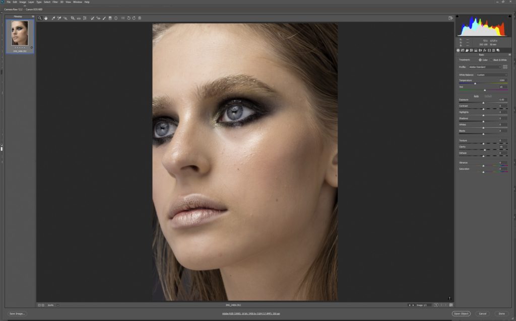
This is done during raw conversion stage (to learn more about how I work with raw files, please check out this article). Depending on what current state of colour is and which mood I decided to go for, I do my initial colour assessment and corrections during this stage. Changes are usually done by modifying colour balance and tint slider first. I usually try to get as neutral (ie correct) white balance as possible first, meaning that I want my whites to be white, grey to be grey and blacks to be black (but it also depends on the mood of the photos).
The idea here is to get rid on any unwanted colour cast. From there I decide on how does that fit into the mood I want to achieve. If, for example, the series is shot during, so called, “golden hour” and all the colours are meant to be warm and with reddish/ orange tint, this is where I would start to dial in the colour tint. Also, keeping in mind that the final look will be achieved in Photoshop during the final stage of edit.
Individual colour changes
This is also the moment, during raw conversion stage, where I would want to do any extreme individual colour modifications. Working directly on raw file, as oppose to converting to tiff and making big changes in Photoshop, gives me additional colour flexibility. To put that into plain words, I can change colours more in raw converter before starting to get artefacts or other unwanted problems.
For example, if I wanted to make big changes to, let’s say, colour of model’s dress. I would go into colour tab in my raw converter and modify the colour there as much as I can. Remembering however that the final colour would be achieved in Photoshop.
This is also the phase where I would enable lens correction profiles and would analyse the images for any unwanted problems like chromatic aberration for example.
As per my workflow, I would then progress into the next stages of my workflow: cleaning, D&B, exposure modifications. You can read more about each of those stages in earlier parts in this series:
Part 1 – my skin retouching workflow explained
Part 2 – my skin retouching workflow explained some more
Part 3 – my skin retouching workflow – luminosity and exposure
The next phase is after these is colour correction stage.
Colour correction
This is a very important stage where I would analyse the whole image again looking for any colour problems. Then using various Photoshop adjustment layers (more on that later), I would go around the image and correct all the problems.
When it comes to which tools I use, I don’t have specific rules. Mostly, I use these adjustment layers in combination with their masks: curves, colour balance, gradient map, solid colour, selective colour, hue/saturation.
If one adjustment isn’t working for me, I delete it and try again, or add another adjustment layer on top to fine tune the modification. It all depends on what and how severe the problem is.
Skin tones
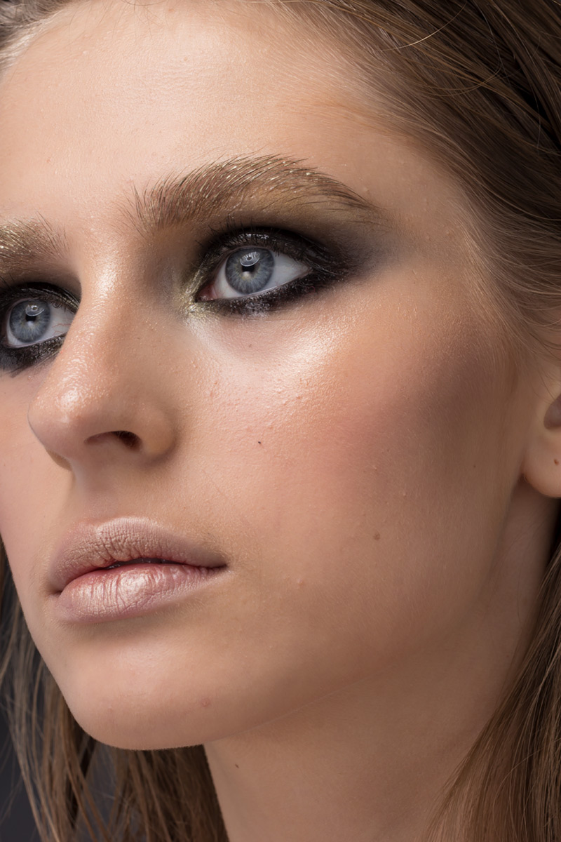
This is also the point where I would work on skin colour. Often, bottom part of the body (as well as arms and legs) would have a slightly different colour hue than face. Using the layers mentioned above, I would then correct skin colour as much as I want. However, as a side note here, my goal is not to make the skin completely uniform all over. I find that if I do, it doesn’t look natural. Instead I leave a slight colour variation so that the end result is more natural looking. Natural look is my ultimate goal. I want to be as invisible with my work as possible.
This is also the stage where I would want to check for any unwanted colour casts again and make final corrections. The way I think about this stage, is this is the point where I want to have all individual colours dialled in, so that they are ready for the next stage – colour grading. Before moving to the next stage, I go around image, checking each individual colour and deciding if it fits into my final colour look I have in mind. If no, modify it. If yes, move on. After that is done, it’s time to move to the next stage.
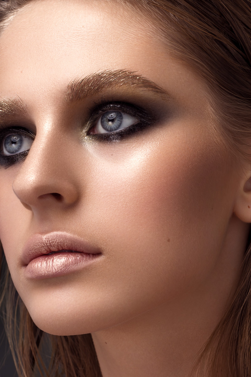
Colour grading
At this point, I should have an image that is 95% finished. All that remains is final colour touches. Yet, this is also a very important stage where the mood of the photo or series of photos is dialled in. This is where the final look of the image is achieved. Rarely I make any local changes at this point. I am usually zoomed out all the way and work more on global changes to the image.
If there are any colours that were dialled in previously and it is important to keep them that way, I would usually exclude them from this stage using masks.
My favourite Photoshop tools for colour grading usually are: colour balance, curves, gradient maps and LUTs. In combination with various blending modes and opacity levels.
Highlights, mid-tones and shadows
The way I work with and think about colour grading is I separate the image into 3 parts – highlight, mid-tones and shadows. As I am more advanced, I do that automatically in my head, but if you are only starting out, it might be easier for you to create separate adjustment layers for each of those. Also, a tool that might help you to visualise changes to those 3 areas is a colour balance adjustment layer. It is already separated into those 3 areas. You might want to create 3 separate layer to control each of those separately too.
The reason why I split each image like that during colour grading stage is that it is easier analyse and decide what needs changing that to analyse the image as a whole. My thinking process here looks as follows: “what my shadows look like now versus how I want my shadows to look to convey the mood I picked”. Same with highlights and mid-tones.
This is not something you can learn within a day, but by splitting each image into smaller blocks, it should become easier with time. As always it is all about practice
Plug-ins and presets
A few words about plug-ins here. As you might have noticed I don’t use any 3rd party plug-ins. When I was still getting grips with retouching and learning, I decided I wanted to learn everything manually so that I am in total control and to learn the process as well as I can. I decided that if I wanted to add plug-ins or presets into my workflow later, I always have that option. I learned to do everything manually to be in total control… and it stayed that way. Plug-ins and presets can be useful but they can also be heavy-handed in the way they treat colour. As a professional retoucher, I want to be in total control and don’t rely on a 3rd party plug-in that could stop working or could be changed or modified by its author at any point.
My advice to you is to give plug-ins and presets a miss until you learn to do everything manually. After that, if you want to add a plug-in or a bunch of presets into your workflow, you will be doing it fully understanding on what they do and, more importantly, how they do it.
Photoshop
So, the way I colour grade is by using Photoshop adjustment layers.
Remembering what the mood needs to be in the photo / series, I add and modify various layers to achieve a desired look.
There are no golden techniques that would work in every scenario, so it is not easy to teach this stage. Best thing to do is to look for and analyse as many good images as you can find. Make a conscious effort to stop and look at every good image you can find. Try to analyse how the colours in the image convey mood and what that mood is.
We all like different things
Working with colour is a very individual thing. We all like different colours and colour schemes. But there are a few universal colour rules I would start with. Start by learning basic colour theory. There are various books and online articles about the subject, here are a few I can recommend and bought myself:
“The Complete Color Harmony, Pantone Edition” by Leatrice Eiseman
Colour: A Workshop For Artist and Designers” by David Hornung
Colour harmony – Wikipedia
Color Harmony – Why Hulk Wears Purple Pants
There are also a couple of tools I use for colour grading. They help me visualise colour schemes, plus to see check which colours work together well:
Adobe Colour Wheel Tool – you can actually export colour schemes to Photoshop
Color Scheme Designer and its newer version Paletton.
It is also important to look at as many good images as possible often. Also, follow your masters, work of which you appreciate.
And that is it really. This is more of an introduction into colour work, than a comprehensive guide. In future, if there is a need for it, I might write a separate article about each stage and dive deeper into what I do in each stage, what exact tools I use to solve specific problems. If this is something that would interest you, please leave me a comment and let me know.
Thank you
I would like to thank you, Dear Reader, for following the series and would like to apologise for crude and raw style of my writing. I hope it is easy to follow and understand, but if you would like me to explain something in more detail, please drop me a comment bellow.
If you want to read other parts of this free photo retouching workflow guide, please see the links bellow:
Part 1 – My Skin Retouching Workflow Explained
Part 2 – My Skin Retouching Workflow Explained some more
Part 3 – My Skin Retouching Workflow – Working With RAW
Part 4 – My Skin Retouching Workflow – Luminosity and Exposure
Part 5 – My Skin Retouching Workflow – Curves Tool – Why is it important?
Part 6 – My Skin Retouching Workflow – Introduction to Colour
Part 7 – My Skin Retouching Workflow – How to fix fingernails in Photoshop
Part 8 – My Skin Retouching Workflow – Simplify the image – remove distractions
If you would like to buy me a coffee, please use the link bellow. Thank you!
About the author

Adrian Alexander is a senior retoucher and founder of Ad Retouch Studio, photo retouching and post production studio based in UK. His first contact with Photoshop was in the 90s, but he found his true love of editing photographs during his photography years, which started when he purchased his first dSLR camera in January 2009. These days he is concentrated on his retouching business, finds pleasure in teaching, but his true love is still improving photos in Photoshop.